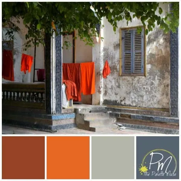
Today I want to share with you a beautifully ordinary picture. It’s laundry, hung out to dry. But not just any laundry. These are the saffron robes of monks at the Wat Bo monastery in Siem Reap, Cambodia.
Am I the only one who finds it comforting that even holy men have to do laundry?
These colors and subject matter caught my eye, and I found myself struck again at the harmony to be found in contrasts. Both in life, and in color. This temple is one of the oldest in Siem Reap, and it looks it, but those robes look so fresh and new and vibrant.
You can get a similar effect when using contrasting (otherwise known as complimentary) colors like the ones above. They energize each other and keep your eye moving. This can be good or bad, depending on what you’re going for, but if you’re looking to punch up the energy in a room, consider a color palette like this one.
For more amazing pictures of Cambodia, and all sorts of other wonderful places, check out my friend Tim’s travel blog, Flat Tires and Slow Boats. Thanks, Tim, for letting me borrow your photo!


Beth Niebuhr
Thursday 15th of January 2015
No, you're not the only one who finds it comforting that even holy men have to do laundry! I love that palette! Great picture of Tim's and you put it to good use. Gorgeous.
Meredith
Saturday 17th of January 2015
Thanks Beth! :)
Pamela@haartfelt
Thursday 15th of January 2015
That looks like a movie set, how beautiful. Yeah the color palette thing I don't get. I never what color to put where. Maybe a post on how to implement a color palate for dummies? : )
Meredith
Saturday 17th of January 2015
That's a great idea! I'll give it some thought. In the meantime, here's a great little post on color theory that Jeri shared with me the other day... http://blog.hubspot.com/marketing/color-palette-famous-websites
William Rushio
Thursday 15th of January 2015
that actually looks like a set up picture, where the photographer put it togther. Sometimes truth is stranger than fiction. Funny how sometimes if you are in the right place at the right time, you see something amazing.
Meredith
Saturday 17th of January 2015
Yes, and you have to have your eyes open at the right place and right time!
Leora
Wednesday 14th of January 2015
Great color! But it would quite a daring palette to use on a web page. Will have to visit Tim's blog and see more.
Meredith
Saturday 17th of January 2015
You're right Leora, "daring" is the perfect word for this palette.
Tim
Wednesday 14th of January 2015
When I took that picture I knew it was a keeper. Glad you were able to use it and thanks.