Last Saturday, my family and I spent the whole day cleaning up the yard. And by family I mean hubby and me, and occasionally the kids would pull a weed or two. They have short attention spans, and frankly I just wanted to get the job done, not spend time making it a "teaching moment."
So now the allergies are properly fired up, the yard is starting to turn vaguely green again, and it's beginning to feel more like spring, although we opened the day here in New Mexico with snow flurries.
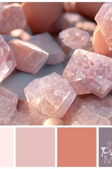
In the spirit of spring, I wanted to do a lighter palette today, and found this beautiful picture of robin's eggs. (If you look at these and determine they are in fact some other kind of bird's eggs, please don't tell me. It will ruin my impression of them.)
I wish I could tell you we found these in our backyard while cleaning up, but it's probably better for the baby robins-to-be that they were found by some kind and conscientious photographer and not my curious daughters.
![]()
The Valspar colors are as follows from top to bottom:
- Warm Buff
- Crystalline
- Encounter
- Buffalo Prairie
This palette would be fun in a bathroom or even better, a sunny front porch, with fun pillows on the outdoor furniture. So welcome, Spring! And good luck, baby robins, wherever you are...
Photo credit: Michiel Thomas / Foter / Creative Commons Attribution 2.0 Generic (CC BY 2.0)


Karen says
My house is brick in the top color with trim in the bottom color. The front door is the darker blue. Nailed it!
Meredith says
Nice! Great minds think alike! 🙂
Rena McDaniel says
I just redid my bedroom in these colors and love it!
Meredith says
How pretty - glad you love it!
Johanna says
Loved your interview, not sure how aware of it you are, but your profile picture is wonderful. It somehow emits a glow and beauty that I think is reminiscent of your love for what you do. So kudos to whoever took that picture. (And to you for letting the glow out) 😉
And I love spring. And spring colors. (I like summer, fall and winter colors too...probably why actually decorating is so hard for me. I love everything!)
Meredith says
Thank you my sweet friend - you are too kind. 🙂 And loving everything may be a detriment in decorating, but it's a good problem to have!
Beth Niebuhr says
Very pretty.
Meredith says
Thanks Beth!
Sandy says
Love the idea of turning to nature for a colour palette - the colour also reminds me of the beach!
Meredith says
Yes, I think all my favorite colors come from nature, especially the beach!
Arleen says
Blue is my favorite color. Today using color in your house is now in. White walls and wallpaper are out. The best thing is that if you don't like it you can always repaint it with another color. Love the idea of the egg robin blue in a sun room.
Meredith says
That truly is the best thing about paint - it's so easy and cheap to change. I love wallpaper, but it's such a commitment!
ballnchainz says
This is Jay,
my wife has been hinting around about painting our bedroom, and living room. I am not looking forward to the color palette that she is about to stuff in my face.
Meredith says
I know, my husband is always skeptical at first, but by the end he usually concedes that he likes it. Happy painting!
William Butler says
Hi Meredith,
Robin eggs are a sure sign of Spring.
I like the Encounter palette. How percentage of blue and green produces this one?
All the best!
Bill
Meredith says
Thanks Bill! It's hard to pin down percentages because first you have to get the right blues and greens to start with. This one is heavy on the cerulean blue. It's the only way to get that lovely sky blue color.
Jeri Walker-Bickett (@JeriWB) says
I'm more drawn to blues now than I used to be. It's interesting how the colors we find appealing tend to shift over time.
Meredith says
I agree. When I posted this one, I noticed that several of my latest palettes have been blues. Maybe I'll branch out on the next one!
becc03 says
I'm a fan of blue, so this appeals to me.
Meredith says
Glad you like it!
Lenie says
Hi Meredith - first, I loved your interview on Blogging on the side - let me know you a bit better - second, I love the colour palette you laid out. Guess you need to be an artist to see things like that. Keep it up, you continue to give me great ideas.
Lenie
Meredith says
Thank you for the encouragement Lenie, you are so kind!
jacquiegum says
I did my guest room in my last house very close to this color palette! The blue was bit icier and the the brown a bit taupier. I was concerned that I would tire of it but after 8 years, I hadn't. I understand the new owners repainted the room in the same colors:)
Meredith says
That's the best compliment, that they redid it in the same colors! Blues and taupes are one palette that never seems to go out of style.
Welli says
I like blue, my favourite colour. Life is about color as it makes every day better.
Meredith says
Thanks Welli, I agree!
Suzanne Fluhr (Boomeresque) says
This blue is a little less blue than what I generally think of as robin's egg blue, but because of that, I think it's more suitable for a paint color. As someone above mentioned, I find myself more drawn to blues and blue-greens as I get older. We're living in Hawaii for 3 months and I'm mesmerized by the blues in the water. Along the shore in southern New Jersey, the closest to our home in Philadelphia, the water color can best be described as a brownish-grayish-olive greenish---not a hint of blue. However, the sand is very fine, so if the light is right, at low tide, the blue sky is reflected on the sand which is kind of magical.
Meredith Wouters says
Yes sometimes we have to adjust colors a little bit to use on our walls. Colors that are absolutely breathtaking in nature would be a bit overwhelming in a small space like a bedroom. How wonderful to have that Hawaiian experience!
Christina says
Blue is one of my favorite colors. And I liked how you brought brown's into it.
Meredith says
Thanks Christina!
Paul Graham says
Great Palette Meredith. Not one of my personal favorites but that's why there is chocolate and vanilla and it is beautifully balanced and very flexible. Of all the natural tags that are applied to various colours I find this one of the most evocative because of the freshness and delicacy
Meredith says
Thanks Paul. That's what I love about color - something for everyone!
niekkamcdonald says
I was going to say this is a great color palette for the bathroom. So pretty and perfect for Spring.
Meredith says
Thanks Niekka - I'm so ready for Spring!
theJenWeaver says
Beautiful! Love that color palette! Now to find a place to apply it in my home. 🙂
Meredith says
Thanks Jen! 🙂
andleeb says
This is very nice to look nature and find your own combinations. I have never tried these colors before but next time I will use your color palette. It looks very nice. It is nice that color is refreshing, soothing and light.
Thank you for a nice Idea.
Meredith says
Thanks Andleeb. Nature is full of beautiful color combinations, especially this time of year!
simplysherryl says
I would love my office in these colors. Warm and inviting..what a beautiful combination.
Meredith says
Thanks Sherryl, that's a great idea! It would be a happy worskpace.