This Olive Color Palette combines muted greens and red tones for contrast and interest, without overwhelming the senses.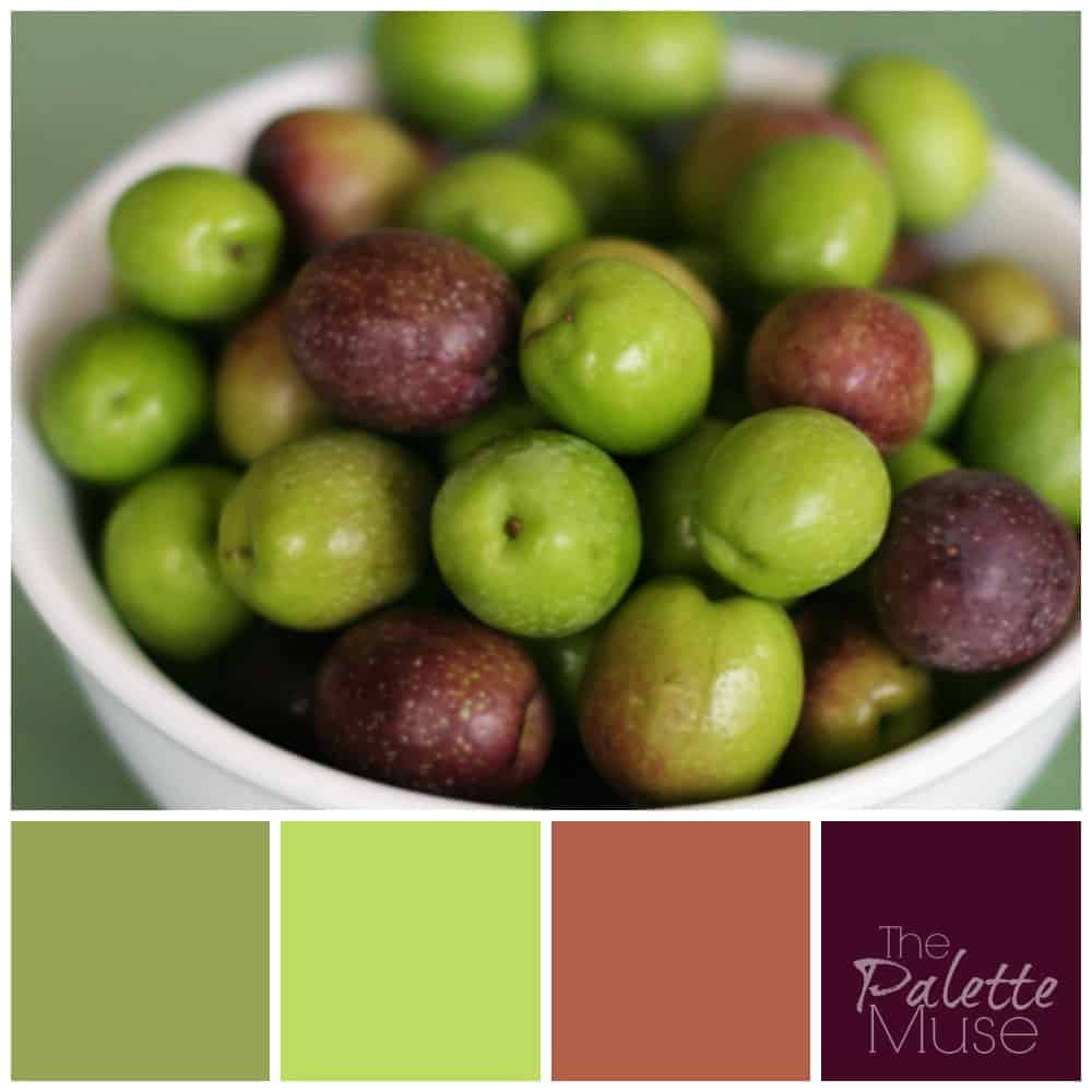
When I first saw this picture, I thought these were tiny apples, but upon closer inspection I realized they are olives. I hate the taste of olives (I can spot one a mile away and half buried in cheese on my pizza) but I do think they're beautiful, especially in their natural state. They conjure images of Tuscan vineyards and sunny Italian hillsides. Color, like aroma, is such a good transporter!
Photo credit: macro girl / Foter / CC BY-NC-SA


Anna Khan says
Wow
I never see red colored olives... I only know about green and black...
But the palette is beautiful
Anna Khan says
Between I am thinking about capsicum Palette now, as there are mostly three colors that I see... What do you think... will it look nice?
Red, green and orange ????
Jeri Walker (@JeriWB) says
I don't know much about the psychology of color, but I instantly know I like and respond to this palette very much 😉
Meredith says
Thank you Jeri! That's all you really need to know. 🙂
Shannon @ Of The Hearth says
I love these colors! (Though I hate olives, too!)
When my husband and I got married, we used plum and a green that was somewhere between lime and chartreuse as our wedding colors. Ever since then I've been fond of plum and green together! 🙂
Meredith says
That sounds beautiful! Glad to bring back some happy memories. 🙂