My life doesn't always allow me to travel as much as I'd like, so sometimes I live vicariously through other folks who are actually globe trotting. Or at least driving farther than their local elementary school.
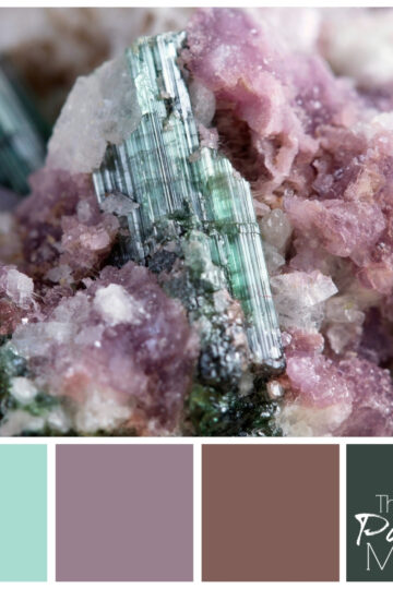
Fortunately, my parents just took a trip to France, so I've been devouring all their stories and photos. This one particularly intrigued me, due to its unusual orientation and full spectrum of colors. It's the view upwards toward the top of the dome of the Basilica Notre Dame, in Lyon. (Not to be confused with THE Notre Dame, in Paris.)![]()
The colors, by Valspar, are (left to right):
- Relaxed Navy
- Swiftly Green
- Pebble Creek
- Billiards Room
I've come to look at everything that attracts my eye with the question, "How would I decorate around that?" Decorating around a piece that contains every color can be challenging. How do you pick just a few?
In this case, I was most drawn to the greens and blues, and of course the gold accents. They seem so regal. At first I had a royal red too, which is definitely in there, but when I pulled it out into a color swatch, it seemed to stick out a little bit too much.
You might find that issue in decorating too. For instance, if you're working from a pillow that has an accent color in it, that color may look completely different when you paint a wall with it. You need to be able to translate that color from what your eye actually sees, to what your brain interprets.
Lots of times, the original color just needs to be muted a little, either lightened or grayed out a bit. If you find yourself struggling with this, I can help you out!
For some reason, this palette strikes me as a good one for a man cave, or a study. Maybe it's the blues and greens. Either way, it's a classic. If you don't believe me, just go to Basilica Notre Dame and check it out for yourself!
*By the way, I'm always looking for new photos for color palette inspiration. If you have one you'd like to share, please send it to me and I'll make a color palette for you out of it, and share it here.


michelelobosco says
Hi Meredith, I love this image and the color palette. It's so soothing…I can definitely see these colors as being perfect for a man cave!
Michele
Meredith says
Thanks Michele!
Tim says
I'm a man cave-less man and ok with that. However, if I did have a cave, I would love these colors. Accented by chocolate colored furniture and pop of red here and there. Too much, maybe. What do I know. I will leave it to you and the folks who designed the Notre Dame.
Meredith says
Yes! That doesn't sound like too much to me. 🙂
Jacqueline Gum says
The image is stunning but I really do love the palette's that you can pull together using an image. I actually find this one to be peaceful...even bedroom kind of peaceful! I know what you mean about the struggle between the eye and the brain! Sometimes than can be epic:)
Meredith says
Thanks Jacquie! I think it's peaceful too. I imagine that's how it feels, sitting in the cathedral under this dome.
William Rusho says
The combinations of the shapes and the color draw your eyes to the center, which I think is what was intended when it was built.
Meredith says
Yes, I love the detail, symmetry and movement. It's truly a work of art.
Michael Rochin says
GREAT article! I am not the best at matching decor but it looks like you have it all taken care of!
Meredith says
Thank you Michael!
Beth Niebuhr says
It is very soothing. One thing I found when figuring out what to put in a new house was that colors that look good at a paint store don't always work in the location they will fill.
Meredith says
You're so right Beth. Even though I should know better, I still sometimes have to start over once I get the paint on the walls. It's not easy!
Susan Cooper/findingourwaynow.com says
Beautiful photo. I agree with Jaqueline, I think the colors would make for a serene bedroom. Very peaceful and relaxing.
Meredith says
Thank you Susan. I agree - can you imagine looking up at this on the ceiling of your bedroom?
Jeri Walker-Bickett (@JeriWB) says
If I was feeling up to painting my office, I would likely choose colors similar to this category and would love some lined curtains to match.
Meredith says
I know, it takes a lot of energy to repaint a room. Just picking the color is exhausting!
William Butler says
Hi Meredith,
This pastoral palette that invites prayer and meditation.
I think you did an excellent job of matching colors. Enjoy your week!
Bill
Meredith says
Thank you Bill! Fitting for a French basilica, no? Have a great week!
Donna Janke says
I like how you are able to pick out a colour scheme from something that intrigues you. This a very soothing palette.
Meredith says
Thanks Donna!
Erica says
Hi Meredith! This is really interesting. I do find the color scheme very calming. I've never been great at looking at color on a swatch and being able to accurately see how it will come together in a room. It is really fascinating to see how you put it all together.
Meredith says
Thank you Erica! It's always a challenge, but that's what makes it fun for me! 🙂
Lorraine Marie Reguly says
When I think of man-caves, I think of darker colours. However, these would be good for a bachelor pad!
Meredith says
Thanks Lorraine, I can see what you mean about the darker colors to truly make it a man cave.
patweber says
How beautiful. The colors are so subdued and relaxing. Great pic too. My husband and I have several from the churches we visited in Italy.
While for me it isn't a man cave candidate, it could definitely fit a man's room! Nice.
Meredith says
Thank you Pat! It's always worth looking up when you're in those old cathedrals and churches!
Arleen says
I love your choices of color. However it could be that the way my monitor looks it makes me feel good. I actually did two of the greens in the master bedroom. The back wall the darker green and as I call it the Khaki green on the other three walls. I
Meredith says
That sounds really nice. I love greens. And you're right - it's so hard to tell from a computer screen!
Laurie S Hurley says
I love going to Home Depot and collecting all of the color palettes. Maybe we do have something in common! heehee. I have been to Notre Dame and that is one beautiful photo. I love the palette your created. If I find a good picture, I'll send it over to you.
Meredith says
Thank you Laurie! I love collecting those paint swatches. They're like owning a little piece of the rainbow.
Duke Stewart says
That photo is gorgeous, btw. Must have been a lovely place to visit.
I'm not too good with palettes and am thankful even of wordpress themes that handle the color options. I'm bad at choosing colors/fashion. Palettes are a foreign language to me.
Meredith says
Thanks! Don't worry, you're not alone. There are all sorts of online apps to put together palettes for you. I hope they don't put me out of business! 🙂
Debra Yearwood says
What wonderful and soothing colours. I've had a few paint disasters in my time, notably when I painted the basement a yellow so bright it competed with the sun.. it was awful. After that my husband got more involved in the paint color. I'd show him what I wanted and when we went to have the paints mixed he'd ask the paint guy to add grey or some other colour to mute the choice. Waaaaaaay better results. 🙂
Meredith says
That's hilarious Debra! My husband is always a little nervous when I tell him of a new color scheme. I've been known to repaint a few rooms in my time. Sometimes even the pros mess up!
Deidre M. Simpson says
I like the palette you created. Slowly, I am learning the point of it, having been everywhere seeking paint swatches. Palettes are the way to go!
Meredith says
Thanks Deidre! Yes, sometimes it helps to have to colors pre-coordinated for you!
Holly Higbee-Jansen says
Love those colors, definitely inspires me to make some changes in my office. Have you seen the Adobe Kuller app? I think it's only for iphone. Check it out, it pulls colors from images to create unique palettes. I am a retired interior designer, now photographer - so love all of this! Holly http://www.jansenphotoexplorations.com
Meredith says
Thanks Holly, so fun to meet another designer! I have an android phone, but I'll check for that app anyway. I'd love to use one of your photos someday for a palette, if you ever have one you think would work...
valerieremymilora says
I love how you pulled these colors out Meredith! And I love those colors and think they'd be a great palette for an office. I find them soothing and I love an office that has enough color to be inspiring but remains a calm environment! Thanks for sharing that beautiful photo of Notre Dame in Lyon! Dreamy! I grew up in Paris but never made it to Lyon.
Meredith says
Thank you Valerie. I'm sure there are so many wonderful sights all across France, that it would be almost impossible to make it to them all, even in a whole lifetime!
TheRecipeHunter says
I have been to Notre Dame and that palette is amazing. There is so much truth to what you said about an accent color you may see in a pillow looking completely different on a wall. I'll have to call upon you when my husband and I start redoing our ranch home!
Meredith says
Thanks! Color can be really tricky, but also so fun!
niekkamcdonald says
This color scheme is really nice. You said something that stands out to me about translating the colors your eyes see to what your brain interprets. I have had that problem many times in the past and it is a little frustrating.
Meredith says
Thanks Niekka, yes it can be really frustrating. It even happens to me still, even thought I feel like I should know better by now. So much depends on lighting and surrounding colors, so don't feel bad. 🙂