A few weeks ago, my family went camping near Durango, Colorado, one of my favorite places on earth. It's a haven for fly fishers, campers, and all sorts of outdoorsy types.
I'm not really any of those things, but my husband and kids are, so in the name of fresh air and family time we packed up our camper, some hot dogs, and our 'Dora' fishing poles and set off for the wilderness.
Well, it's less of a wilderness, and more of a state park with about 30 other campers parked among the trees, but we were as happy as we could be. Other than a couple of unfortunate falling rock incidents, it was a great trip.
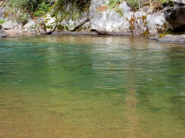 I snapped this photo on a sandy beach area of the creek where we were "fishing" one afternoon. (That water was COLD!) I thought the colors were so pretty and vivid that I wanted to remember them. Alas, my camera couldn't really record how many variations of blue and green ran through the deep water.
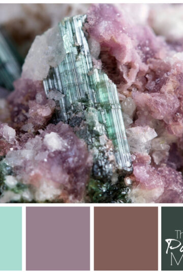
This picture (below), however, did really capture the colors in the rock. Fortunately this was not one of the falling rocks, but it happened to be right next to a very large rock that my 7-year-old tried to pick up and failed, smashing her big toe.
My husband had to carry her up the steep 10 foot embankment from the creek bed, and I thought for a few minutes that our trip would end in a visit to the local ER, but all was well after a little TLC. So, to commemorate the moment, and the trip, I put together this palette.![]()
The Valspar colors are (from left to right):
- Metropolis
- Can't Miss Lime
- Moss Mulch
- Belle Grove Buff
Although the rock is as old as the Rocky Mountains, this color palette feels fresh and modern. It lends itself to natural accents and lots of sunlight. Earthy tones like this do well with a pop of green added in occasionally. If it works in nature, it will probably work in your home too!
Do you have a photo you'd like to see made into a palette? Send it to me - I love a good color challenge!


Limeade Gal says
I like that color palette! Very earthy, yet relaxing. Beautiful spot you camped at. Sorry to hear about your daughter's toe, glad she is ok.
Have a beautiful weekend 🙂
Meredith says
Thank you! It was a fun trip, and what's a camping trip without a little excitement? 🙂
Tim says
That is very cool; the rock I mean. Not the almost crushed toe; TLC works wonders. The cool part is that you looked at this and saw a very modern color palette and I think that is quite a talent.
Meredith says
Thanks Tim. Yes, this rock was much more appreciated than the one that fell on her toe!
jacquiegum says
Love the color palette! My tastes run to the can't miss lime! So refreshing and paired with the earth tones, I could easily see this in any room. But that the difference between us...your eye is so keen that you found this in a rock!!! I don't think I could ever do that...Brava! As to the toe...poor thing:( Hope all is well now....
Meredith says
Thanks Jacquie! Yes, I can't take my eyes off that lime color. I think I've used it before but it keeps catching my eye. And the toe is fine now, thanks!
Pat Amsden says
You've inspired me. I want to do something with the color palettes you've shown l such as robin eggs and the leaf green as well as the color scheme you came up with. I don't have anything needing redecorating at present but it's amazing what comes up once you turn your attention to something!
Meredith says
Thanks Pat! Yes, beware. Now that you have decorating on the mind, you'll be surprised how many ways you come up with to follow through. 🙂
andleeb says
I always love to be in such places with fresh flowing water and cool breeze.
The color palette is very nice and you have made me to think to send you any such picture with lot of earthy colors.. lets see when I come up with something like that.
will surly send you.
Meredith says
Yes, there's nothing like the feel of fresh water on your toes! Can't wait to see your picture.
Donna Janke says
I love how you captured the colours of the rock in that palette. And yes, it does feel fresh and modern.
Meredith says
Thank you Donna!
Ken Dowell says
Interesting to look at the colors that way. Has a kind of dessert feel to it if you only look at the color palette.
Meredith says
You're right, Ken! It does look desert-y when you look at it that way.
Beth Niebuhr says
I loved to camp when my children were young. I never did come up with a color palette from the trips but I guess we all have our own interests and talents.
Meredith says
Yes, Beth, I may be the only one that looks at rocks and tries to decorate a room with the colors in them!
Lorraine Marie Reguly says
Very beautiful pictures, Meredith! I love this palette!
Btw, that says a lot; I don't generally like the color brown, but mixed with these colors, it's not so bad. 🙂
Meredith says
Thanks Lorraine! Glad you liked it, even with the brown!
William Rusho says
I am an outdoorsman in the Adirondacks in NY, and I must say that looks like a gorgeous spot.
Meredith says
You should try Colorado sometime, it's an outdoors paradise!
Krystyna Lagowski says
That's just gorgeous! All my favourite colours - you certainly have an eye. I think the colours we find around us in the great outdoors are not just pleasing to look at, but comforting - maybe even therapeutic. Hope your daughter's toe has recovered!
Meredith says
Thank you Krystyna! You're right, all those outdoorsy colors are good for the soul. And maybe for toes too! 🙂
Arleen says
The color palette that you featured I think is becoming more popular as the tones are soft and relaxing
Meredith says
Thanks Arleen, I think you're right. Nature is always in fashion. 🙂
Susan Cooper/findingourwaynow.com says
I love the pictures and the colors. I'm with you on the camping thing. Don't get me wrong, I love the outdoors. I'm just much happier looking at and taking pictures of the surroundings then doing some the more adventurous stuff. 🙂
Meredith says
Thanks Susan, glad to know I'm not alone in my camping reluctance. 🙂
thetraveloguer says
You clearly have a very artistic eye, to be so inspired by the colours of the rock. The palette is very fresh and modern, despite the fact that the rock is so old! Really cool 🙂
Meredith says
Thank you! I know it's somewhat of a cliche, but I really am inspired by colors in nature.
lenie5860 says
Hi Meredith - I love the colours. They are so calming, just like everything else in nature. Both pictures are great but the one of the rock is outstanding - amazing how you saw and captured those colours.
Lenie
Meredith says
Thank you Lenie!
Alice de Sturler says
Very peaceful colours, I love the fact that you get your inspiration from nature.
Meredith says
Thank you Alice!
Eve Koivula says
I love the picture of that rock! I actually have a "thing" with canvases like that and this has the most beautiful colors, too.
Meredith says
Thanks Eve, glad you liked it!
bindu saju says
Very nice palette. You are very good in finding combinations from nature.
Meredith says
Thank you! Nature always presents an interesting color challenge.
jbutler1914 says
Those are some wonderful pictures. The palette looks nice as well.
Meredith says
Thanks! The best thing about the pictures is the memories they represent.