I know that fall is approaching because this is the first week we haven't been in the 90's all week, but I'm still clinging to summer in my mind. While most folks are putting up their fall decor, I'm still trying to coax the last bit of life out of my spring colors. That's why, when I saw this blueberry picture, I just had to use it for something. 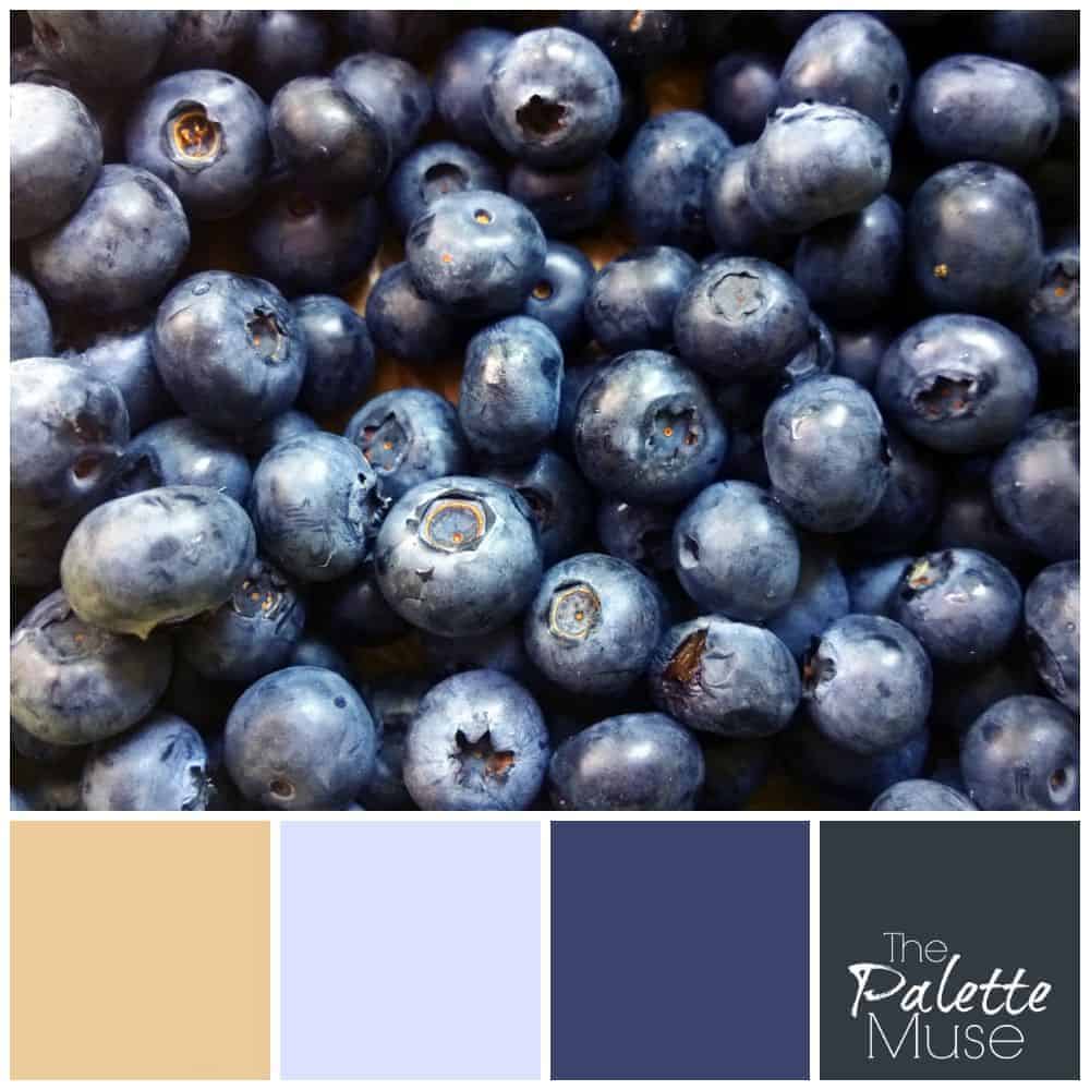 When you're building a color palette to use in your home, it's usually a good idea to include a version of a contrasting color to offset your dominant colors. Here, the blues are obviously the dominant color, and that soft straw or camel color provides a nice backdrop.
Here's to the last remaining days of summer (if you have any in your area) and to the last of the fresh blueberries!


Susan cooper says
Love fresh blueberries and they are a beautiful color. Just not sure if id like it on my walls. Maybe accent wall with your beautiful coordinating colors.
Meredith says
Yes, Susan, I think an accent wall would be beautiful. That bright blue might be a little much in a whole room!
jacquiegum says
I would never have thought to use the color of blueberries, but it's just beautiful with the coordinating colors!
Meredith says
Thanks Jacquie, you just never know where inspiration will come from!
Sabrina Q. says
I love it! I was looking for a new color for the basement. Thank you for sharing.
Meredith says
I'm so glad Sabrina, thanks!
Pamela@haartfelt says
I LOVE this palette! And blue isn't one of my favorite colors. But this blend would give such a rich welcoming feel to a room. I've already, "grab" the palette and tucked it away
for inspiration.
Meredith says
Thanks Pamela! I hope it helps someday when you're planning colors...
Suzanne Fluhr says
I never would have thought of this contrasting color with the blues, but you're right, they work beautifully.
Meredith says
Thanks Suzanne! Without a contrasting color, the blues could be a little overwhelming.
safariontheblog says
Oh wow! I love this palette. It gives a warm welcome feel to a room.
I love fresh blueberries, never have thought to use the colour.
It is beautiful!
Meredith says
Thank you! It's always surprising to me that blue can be such a warm color!
Erlene says
Never thought to look at fruit for color inspiration in the home. It's a nice color palette that you've put together.
Meredith says
Thanks Erlene, you never know where inspiration will strike next! 🙂