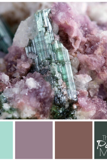
A monochromatic mix of dusty greens makes up this moody early dawn color palette.
They say it's darkest before the dawn, but no mornings are darker than those first few after daylight savings time change.
I've been in a mood all week, since springing forward. It sounds so fresh and fun... "springing forward" but it really just means I lose an hour of sleep.
And not just an hour that first day, but for several days after. I can't make myself go to sleep earlier, even when the clock says it's time for bed.
My husband claims that if I'd just get up earlier in the morning, I'd have an easier time falling asleep at night. He may be right, but we'll probably never know. I've never been a morning person, and I'm not about to start now, when morning comes before it even should.
All this ranting about daylight savings time has made me a little moody, so I thought I'd do a color palette in honor of the season.
Dark Dawn Color Palette

I love these moody greens. I'm sure that the meadow in this picture looks quite vibrant emerald in the sun, but with the mist of early morning covering it, only the muted shades of mossy green show up. In fact, you really have to look closely to see the green at all.
How to Pull Off Monochromatic Color Schemes
Making this color palette reminded me of a little known truth about color: what you see isn't always what the color actually is.
Color is fundamentally relational. You may mix a color on a palette, but when you put other colors next to it, they all work on each other to bring out different nuances. This might sound a little academic, but when you go to design a room, it becomes very real.
In my post about picking the perfect gray, I went into a little detail about how gray picks up on the colors around it. But what I didn't point out is that all colors do this. That's why, when you're picking paint colors, you have to take into account all the adjacent colors in the space.
In fact, when you look at this green color palette, you might assume that the four colors along the bottom are shades of the same hue, or color. But I actually had to use different underlying colors to get them to look coordinated with the different shades.
Much like my beef with daylight savings time, you can't just adjust things by an hour and expect everything to line up automatically.
But with color picking, unlike alarm clock setting, the challenge of making adjustments is part of the fun. If a good color palette could be created by artificial intelligence, I'm convinced the world would become a very boring place.
Very boring, and dare I say, monochromatic?
So here's to color, in all it's shape shifting and mood affecting glory. I hope your days get brighter this week, and your colors clearer, as we come out of the haze of early mornings and darker dawns.


Leave a Reply