Remember the pastels of the 80's? Mint green, Miami Peach, and who could forget Dusty Rose? Believe me, I've tried.
You may have noticed that in clothing, some of the 80's styles are making a dubious comeback. I just saw stirrup pants the other day on a girl who was too young to know that she hadn't invented that trend. And don't even get me started on neon.
Well, some of the pastels are making a comeback too, especially in home design. This fact caught my interest the other day as I was reading a decorating magazine (I have the best job in the world where reading House Beautiful is defined as research for my job!) and I was captivated by a room done in pastels.
It looked so fresh and inviting and it got me wondering what the difference was between these "new" pastels and the horrible memories I have of my flamingo-spangled bedroom of the 80's.
The answer is: this ain't your momma's pastel palette.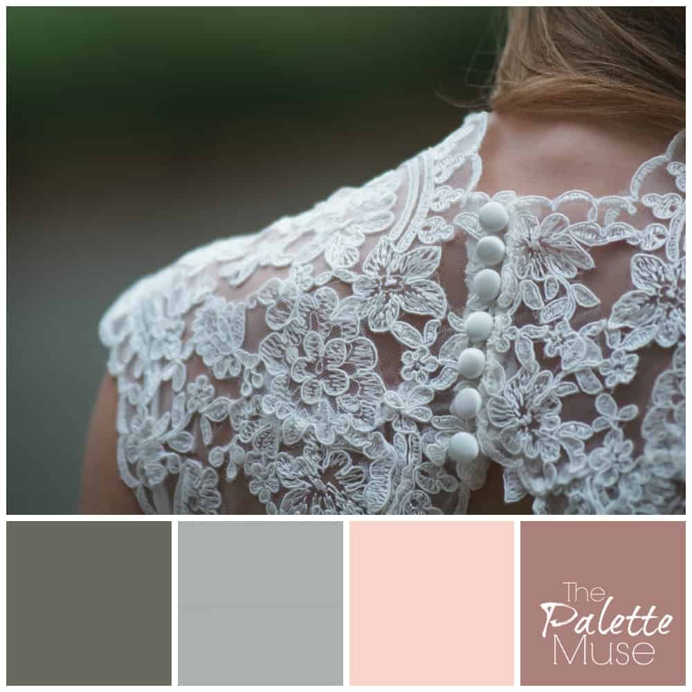
To use pastels successfully, I believe you need to muddy them up a little. So rather than straight greens and pinks in this one, they've been toned down with a significant amount of grays. If you're selecting paint color for a room, this is easy - you just ask for one of these colors.
If you're mixing your own paint, for an art or craft project, you achieve a muddier color by adding a little bit of the complimentary color to your mix. In other words, if you're mixing a light pastel green, you add a tiny bit of red or pink to the mix. For peachy colors, add blue. And for dusty lavenders, add yellow.
I really love soft pastel colors, and I'm excited for a chance to use them a bit more in my home. Bring on the pink and gray!
How about you - are you scared or excited about pastels?


Emily Mulder says
I love this!
Meredith says
Thanks Emily!
jacquiegum says
Seems like everything old is new again! This does look much fresher. I love it!
Meredith says
Yes, even a few things that should never come back into fashion! 🙂
Sandey says
I'm helping my 80 year-old Mom weed out her closet and yesterday we found bright turquoise stirrup pants. She'll be thrilled to know they are making a comeback with the young-ins. And in every one of your posts, you always have a phrase or a quote that makes me laugh out loud. "Flamingo-spangled" is today's winner.
Meredith says
Ha! Tell your mom that she can proudly wear those turquoise stirrup pants again!
Angela McKinney says
Love this! Thanks for sharing at #HomeMattersParty
Meredith says
Thanks for stopping by, Angela!
Jeannette Paladino says
I actually like pastels in home decoration, especially if you collect art. I think paintings stand out much more on pastel colored walls. Now for wearing pastels, they are all wrong for me. I'm a jewel-toned person myself.
Meredith says
I agree, Jeannette! I look terrible in pastels, but they certainly have their place, especially as a backdrop to great art.
Donna Janke says
I do prefer the pastel colours muddied up a bit, but am still not too fond of the roses on the right, at least for walls. I would wear the darker rose. I love the grey-green and grey-blue.
Meredith says
Yes, the rose color would be a little much on a wall, but might be pretty as an accent color. I think I could do my whole house in those greys!
Ken Dowell says
I'm a lot more likely to decorate with pastels than I am to wear them. I like your idea of muddying them. Makes them a lot more palatable for me.
Meredith says
Me too, Ken, but probably for different reasons. 🙂
Jeri Walker (@JeriWB) says
I like how you put it... they need to be muddied up a bit. My mom's bedroom is still a temple to dusty rose 😉
Meredith says
Ha! Temple to dusty rose is hilarious. I'm sure she's not the only one, though.
lenie5860 says
Meredith, for the house I love pastel colours. In our old farmhouse we need the brightness, but I do like the idea of muddying them up.
Meredith says
That's one of the great things about pastels, how they lighten up a room. I'm sure yours are beautiful Lenie.
Phoenicia says
I am not a fan of pastels worn head to toe - looks a bit mumsy. However, mixing with stronger colours work. For example, peach and grey work well. I wore this to a wedding last year.
Meredith says
That's a really great point - mixing them with a stronger color or two really helps. (And I love the word mumsy!)
heraldmarty says
Not a fan of pure pastels. For me I think the key is what you called "muddying" the colors up a bit. I think of that as 'muted' colors, but it doesn't matter what the label is, it's the effect that counts and the colors you've shown are really attractive.
Meredith says
Thanks Marty! I'm not a fan of pure pastels either, but these seem more modern somehow.
maxwell ivey says
hi meredith; first time here in a while. interesting post. well I can't comment on the new colors. Making opinions on visual issues isn't my thing. but your post reminded me of our carnival rides in the 80's and 90's. and wwell even now on other people's rides. pink purple and green are very common combinations. except it used to be turquoise and now its more likely to be teal. my dad had our ferris wheel seats painted so hot pink and purple alternated. he also had his references contracts and stationary printed on paper the same colors. hey my dad had more than a bit of showman in him. i think he was more circus performer or movie actor than carney. thanks for helping people out with this post my friend. take care max ps I'm going to disneyworld later this year as research want to go with me? 🙂
Meredith says
Sorry Max, I know some of my posts don't translate very well through a screen reader, but I really appreciate you stopping by to comment anyway. Your dad sounds like a very colorful guy, and I love that he lives that out, even through his stationary!
Tim says
You won't get me wearing a pair of pastel pants, that's for sure 🙂
Andy says
From time to time I use custom pastel colors for setting blockquote background colors at my blogs: for example,
blockquote { background-color: #eeffee; }
gives a very nice pale green. Your muddied pastels would be too dark for this purpose.
The W3C's set of keyword-specifiable colors
http://www.w3.org/TR/css3-color/#svg-color
contains a number of pastels: for example, the table's first color, aliceblue (named after Teddy Roosevelt's daughter Alice), is a blue pastel that would nicely complement the red and green pastels mentioned in your post.
Meredith says
This is interesting Andy - I love to see how people use words to describe colors. I tend to customize my own colors for my website, which is why I like to do my own designing, but a list like that would be really helpful for communicating with a designer.
SafariOnTheBlog says
This is beautiful! Love it x
Meredith says
Thank you, I'm so glad you like it!
Kelly Meier says
hah, stirrup pants! Blast from the past. But I do love the pretty, fresh pastels that I'm seeing a lot of these days! Thanks for sharing at the Creative Inspiration party.
Meredith says
We gotta be able to laugh at ourselves, right? Thanks for stopping by!